TOP 5 WEB DESIGN TRENDS OF 2015
How modern is your website design? Are you keeping up with current design trends?
If you have any of these outdated features on your website, particularly the flash intros or visitor counters, it may be time to consider a redesign, but what style should you go for that’s going to make your visitors sit up and take notice for all the right reasons?
1- Mobile Focus
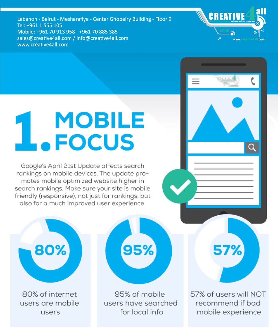
Google’s April 21st update affects search rankings on mobile devices. The update promotes mobile optimized website higher in search rankings. Make sure you site is mobile friendly (responsive), not just for rankings, but also for a much improved user experience.
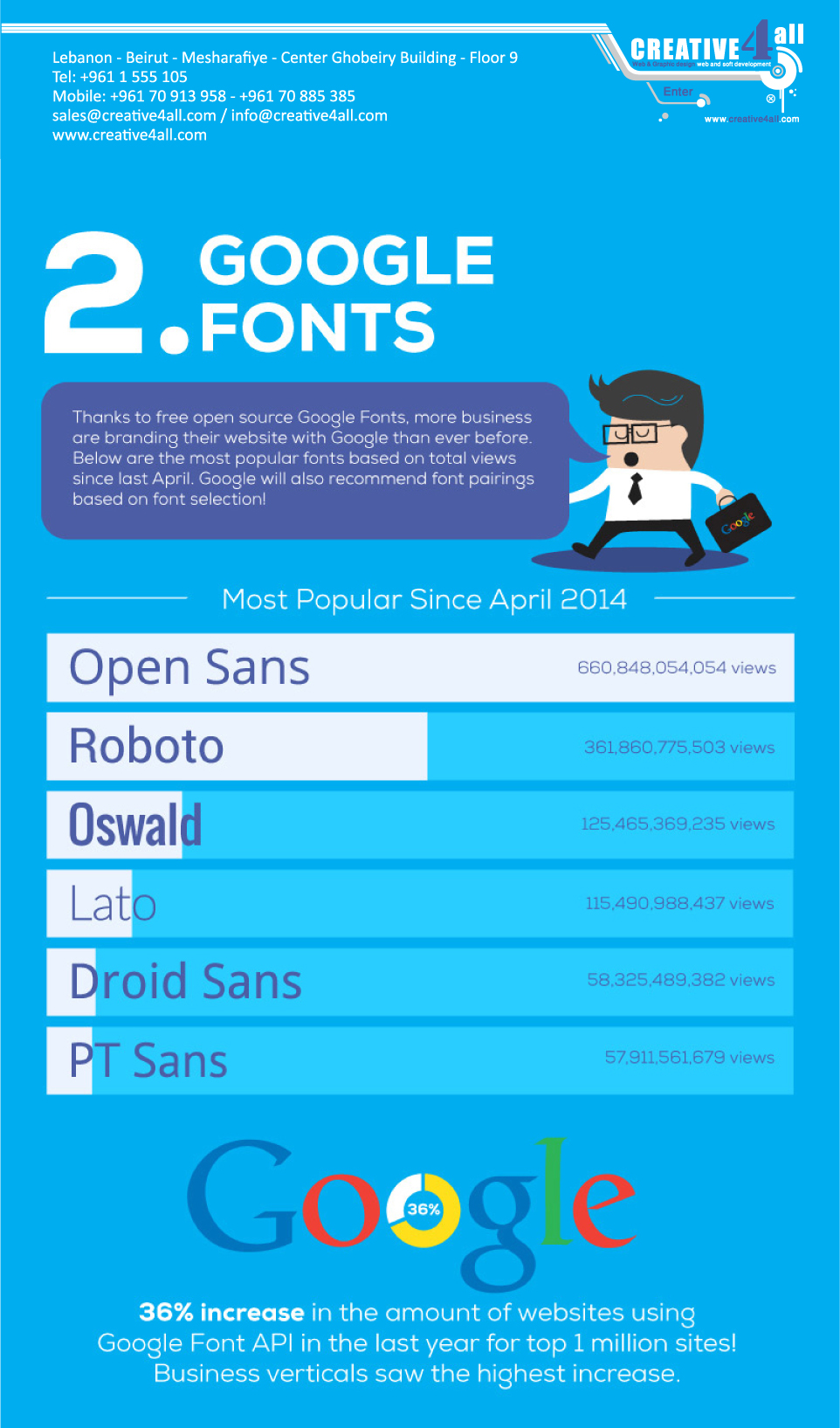
2- Google Fonts
36% increase in the amount of websites using Google Font API in the last year for top 1 million sites! Business verticals saw the highest increase.
3- Flat Design
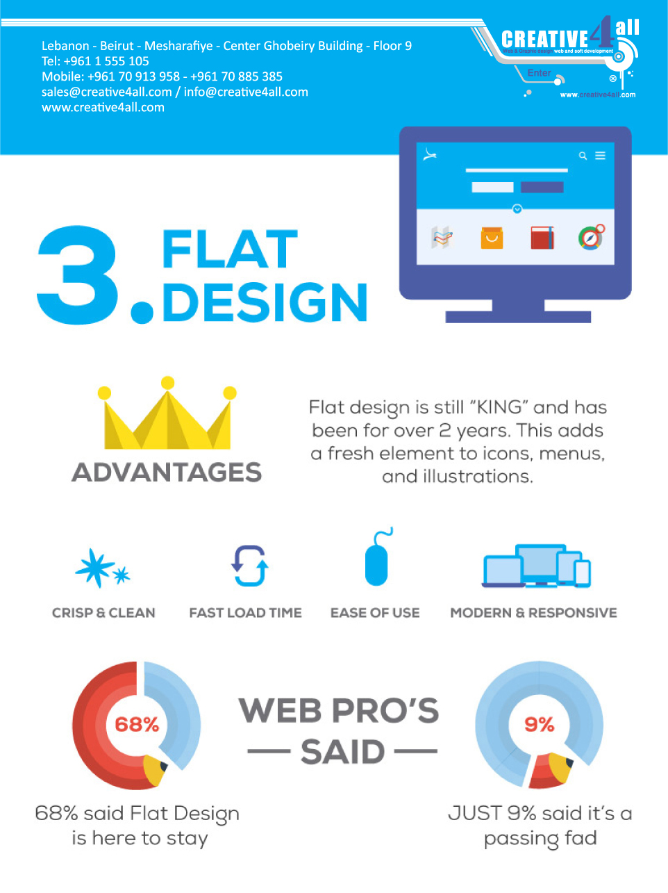
Flat design is still “KING” and has been for over 2 years. This adds a fresh element to icons, menus, and illustrations.
- Crisp & Clean
- Fast Load Time
- Ease Of Use
- Modern & Responsive
4- Sticky Menus
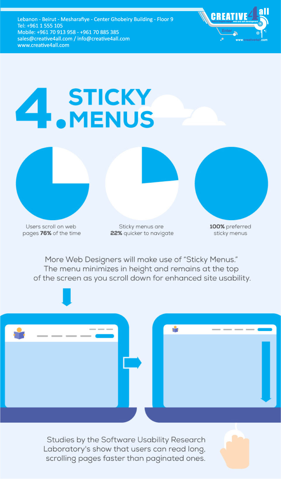
More Web Designers will make use of “Sticky Menus”. The menu minimizes in height and remains at the top of the screen as you scroll down for enhanced site usability.
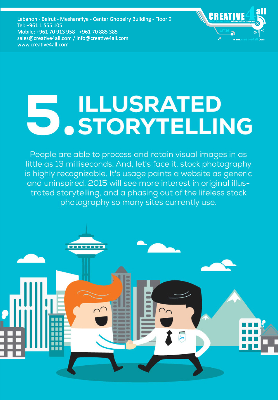
5- Illusrated Storytelling
People are able to process and retain visual images in as little as 13 milliseconds. And, let’s face it, stock photography is highly recognizable. It’s usage paints a website as generic and uninspired. 2015 will see more interest in original illustrated storytelling, and a phasing out of the lifeless stock photography so many sites currently use.
