

For years, “mobile-friendly” was treated as a nice-to-have checkbox for business websites — something worth fixing eventually, but rarely the top priority when a site was being planned or redesigned. That framing is now genuinely outdated. Mobile-first web design is not a stylistic preference anymore; it is the literal basis on which Google indexes and ranks a website, and a growing share of Google’s page experience signals are measured specifically on the mobile version of a page, regardless of how a desktop visitor might experience it. A business still designing for desktop first and treating mobile as an afterthought is, in a very real sense, optimizing for the version of its site that matters less to how it gets found.
Google’s Mobile-First Indexing Explained
What Mobile-First Indexing Actually Means for Your Rankings?
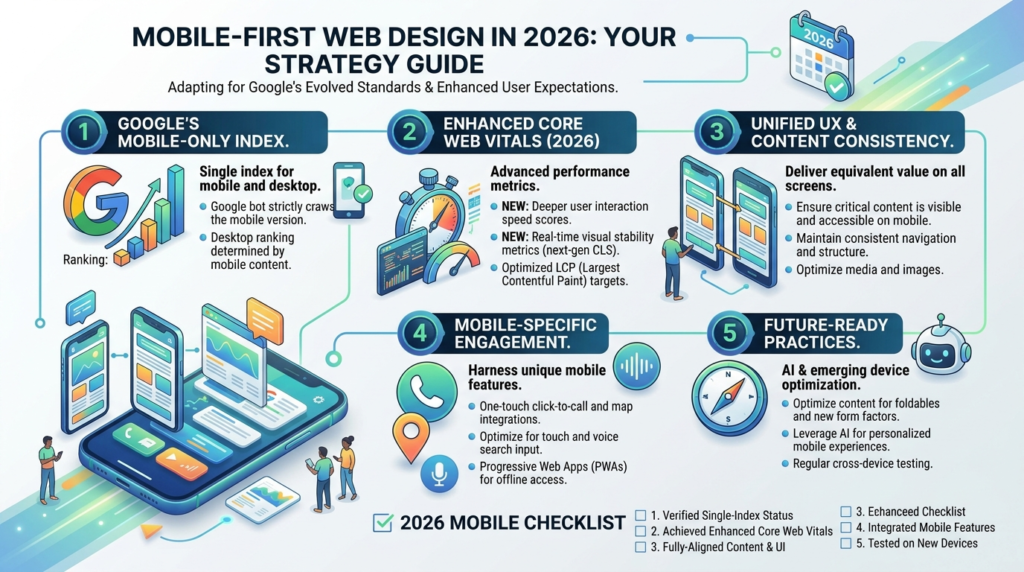
Mobile-first indexing means Google primarily uses the mobile version of a page’s content for indexing and ranking, even when a person searching happens to be on a desktop computer. In practical terms, this means the content, structure, and performance visible on a site’s mobile version is what determines search visibility for nearly all queries, not the desktop version a business might have spent the most design attention on. A site with a rich, well-structured desktop experience but a stripped-down, poorly organized mobile version is effectively showing Google the weaker version of itself.
Why This Shift Happened?
This shift happened because mobile search overtook desktop search as the dominant way people find things online years ago, and Google’s ranking systems evolved to reflect the reality of how most searches actually occur. Mobile search behavior differs meaningfully from desktop behavior too — shorter sessions, more local and immediate intent, and far less patience for a page that loads slowly or requires pinching and zooming to read. A responsive design approach built as an afterthought to a desktop-first process rarely holds up well against these mobile-specific behavior patterns, which is exactly why mobile-first web design has become the standard starting point rather than a later adaptation.
How Mobile UX Genuinely Differs From Desktop?
Thumb-Zone Navigation and Touch Targets
Mobile UX is shaped by a physical constraint desktop design never has to consider: most people hold and interact with a phone using one thumb, which means the easiest-to-reach areas of the screen are a narrow zone roughly in the lower-middle portion of the display. Navigation elements, primary calls to action, and frequently used buttons placed outside this thumb-friendly zone force users into awkward two-handed grips or repeated stretching, which measurably increases friction and abandonment. Touch targets also need genuine physical size — buttons and links that work fine with a precise mouse cursor frequently become frustrating to tap accurately with a finger, leading to mis-taps that erode the experience in ways a desktop-only design review would never catch.
Content Prioritization on Smaller Screens
Desktop layouts can afford to show several pieces of content side by side; a mobile screen fundamentally cannot, which forces genuine prioritization decisions about what appears first, what gets collapsed behind a tap, and what gets cut entirely. This constraint is not purely a limitation — it often produces a clearer, more focused experience than an equivalent desktop page, since it forces a business to decide what actually matters most to a visitor rather than displaying everything at once and letting the visitor sort it out. Mobile-first web design treats this prioritization exercise as the primary design challenge, then adapts that focused structure outward for larger screens, rather than starting with a feature-dense desktop layout and trying to cram it into a smaller space afterward.
Mobile Page Speed and Core Web Vitals
The Three Metrics That Matter: LCP, INP, and CLS
Google’s Core Web Vitals measure three specific aspects of page experience: Largest Contentful Paint (LCP), which tracks how quickly the main visible content loads and should land under 2.5 seconds; Interaction to Next Paint (INP), which measures how responsive a page feels across every interaction throughout a visit and should stay under 200 milliseconds; and Cumulative Layout Shift (CLS), which measures visual stability and should stay under 0.1. INP replaced the older First Input Delay metric specifically because FID only captured a page’s very first interaction, missing the sluggish menus, unresponsive filters, or laggy form fields that frustrate users well after that first click.
Why Mobile Performance Is Scrutinized More Than Desktop?
Because Google evaluates Core Web Vitals primarily on the mobile version of a page under mobile-first indexing, mobile performance carries disproportionate weight in how a site is judged, even for searches happening on desktop devices. Mobile devices also genuinely perform worse than desktops on identical code due to slower processors, variable network conditions, and touch-interaction overhead, which means a page that comfortably passes Core Web Vitals on desktop can still fail badly on mobile if it was not specifically tested and optimized there. Recent refinements to how INP is measured have made this metric more sensitive to occasional slow interactions rather than only reflecting an average across many fast ones, which means pages that were previously borderline may now be failing without any code changes having been made — a good reason to recheck mobile performance data periodically rather than assuming a passing score from months ago still holds.
Testing Your Site’s Mobile Readiness
Tools for Checking Mobile Performance
Google’s own PageSpeed Insights tool provides a free, direct readout of LCP, INP, and CLS scores specifically for the mobile version of any page, based on real user data collected through Chrome rather than a purely simulated lab test. Running a site’s key pages through this tool on a recurring basis, rather than only once during a redesign, catches performance regressions before they meaningfully affect rankings or user experience. Google Search Console’s Core Web Vitals report additionally shows performance trends across an entire site over time, which is useful for spotting site-wide patterns that a single-page test would miss.
What to Fix First?
When multiple pages show Core Web Vitals problems, prioritizing fixes by traffic volume and template similarity produces the fastest overall improvement, since fixing a shared template issue (a slow-loading header, an unoptimized hero image, poorly deferred JavaScript) improves every page using that template simultaneously rather than requiring page-by-page fixes. Server response time is frequently the single highest-leverage fix available, since a slow server response delays every subsequent metric regardless of how well-optimized the page’s own code is — checking hosting quality before investing heavily in front-end optimization often produces the biggest improvement for the least effort.
What Changed in Responsive Design for 2026?
From Per-Page Evaluation to Site-Wide Assessment
Earlier approaches to responsive design 2026 optimization often focused narrowly on a handful of top landing pages, fixing performance issues there while leaving the rest of a site largely untested. Google’s more recent evaluation approach looks at Core Web Vitals performance across a site more holistically rather than page by page in isolation, which means a business can no longer simply polish its highest-traffic pages and assume the rest of the site does not matter. A template-wide or site-wide view of mobile performance has become the more reliable way to catch problems that a narrow, page-specific audit would miss entirely.
Cross-Browser and Cross-Device Consistency
Responsive design 2026 also increasingly accounts for performance and rendering differences across browsers, not just screen sizes, since a growing share of mobile traffic now comes through browsers beyond the one most commonly used in testing. A site that renders and performs well in one mobile browser but poorly in another is still delivering an inconsistent experience to a meaningful share of visitors, and testing exclusively in a single browser environment risks missing these gaps entirely.
Common Mobile-First Mistakes That Undermine Rankings
Hiding Content Behind Interactions Google Can’t Easily Access
Some mobile designs hide substantial content behind accordions, tabs, or interactions that require a click to reveal, under the assumption that this improves the mobile experience by reducing visual clutter. While this can genuinely help usability when done thoughtfully, content hidden this way still needs to be present in the page’s underlying code to be properly indexed, since search engines need to be able to access it even if it is not immediately visible to a human visitor scrolling the page.
Serving a Genuinely Different, Thinner Mobile Experience
Some older websites still serve a separate, stripped-down mobile site with less content than the desktop version, a pattern that actively works against mobile-first indexing rather than supporting it. Since Google evaluates the mobile version as the primary version of the page, any content, structured data, or internal links present only on desktop are effectively invisible for indexing and ranking purposes, regardless of how complete the desktop experience might be.
Frequently Asked Questions
It still applies. Google evaluates the mobile version of a page for indexing and ranking purposes regardless of where the actual traffic comes from, so even a business whose customers primarily browse on desktop needs a genuinely well-built mobile version to maintain strong search visibility.
Not exactly. Responsive design means a layout adapts to different screen sizes, which is necessary but not sufficient on its own. Mobile-first design means the mobile experience is designed and prioritized first, with the desktop version building outward from that foundation, rather than shrinking a desktop-first design down to fit a smaller screen.
Run your key pages through Google’s PageSpeed Insights tool and check the mobile scores specifically, along with the Core Web Vitals report in Google Search Console for site-wide trends. A page that passes on desktop but fails on mobile is a common pattern worth investigating specifically.
Slow server response time and unoptimized images are frequently the biggest contributors, since both directly delay how quickly the main content becomes visible. Checking hosting quality and image optimization first, before investigating more complex front-end code issues, often resolves the bulk of mobile performance problems.
No. Mobile-first design means starting the design process with mobile constraints in mind, then thoughtfully expanding that structure for larger screens, rather than neglecting mobile until the end. A well-executed mobile-first approach typically produces a more focused, better-prioritized desktop experience as a byproduct, not a diminished one.
Ready to Make Sure Your Website Passes the Mobile Test?
Mobile-first web design is no longer optional, and Google’s own ranking systems make that clear. Creative 4 All builds and audits websites for businesses across Lebanon and the GCC with mobile performance and usability as the starting point, not an afterthought. Request a Website Quote to see how your site currently performs where it matters most.