Responsive web design in Lebanon for sites that already exist: we make your current website work on phones and tablets, with menus that are easy to tap, text that reads without zooming, forms that send and pages light enough for mobile data. We keep your content and page addresses, and rebuild only the parts the old code cannot handle.
Yes
We fix what breaks on phones page by page: menus, forms, buttons.
No
Good. We can still test its speed and Arabic and French layouts first.
More than 100 Google reviews written by our clients
Restaurants, hotels, clinics, shops and schools in Lebanon
Every template tested at phone and tablet sizes
Beirut team since 2012, for Lebanon and abroad
Many websites in Lebanon were built for a desktop screen, and visitors now open them on a phone, often on mobile data, moving between Arabic, French and English. We start from the site you have, measure what breaks, and fix the layout, speed and forms without throwing away the content you already paid for.
Sites built years ago for wide screens, now read on phones
French or Arabic pages that break the layout on phones
Checkouts that are hard to complete on a small screen
Sliders, videos and large images that slow every visit
A responsive project should end with a site that reads well on a phone, not with a list of good intentions. Each card below is part of the work, written into your quote with the pages and screen sizes it covers.
You keep your content, your design style and your page addresses.
Six steps from the first test to the published fixes.
Your live site stays online while we work on a copy.
We list your page templates and the screen sizes to cover, using your analytics when you share access.
We measure the speed of each template and open it at phone and tablet sizes in every language, noting what breaks.
You receive the list of fixes page by page, with a recommendation for each template: adapt it or rebuild it.
We apply the fixes on a staging copy of your site, so visitors never see work in progress.
We test every template again at phone, tablet and desktop sizes, in each language, and send test messages through each form.
We publish after your approval, then compare speed and layout with the first test and send you the report.
Three situations we often meet on Lebanese sites, what we change in each, and what to watch once the fixes are live.
The Restaurant Menu Nobody Can Read
Guests pinch and zoom, then call.
The French Labels That Overflow
Fine in English, broken in French.
The Store That Loses Phone Orders
Carts fill up on phones; orders do not.
Reviews posted on our Google profile by businesses in Lebanon and abroad.
This service suits companies whose site still says the right things but is hard to use on a phone. If one of these five situations sounds familiar, a mobile test is the right first step.
Text is tiny, menus overlap and visitors zoom in to read. We adapt the layout to small screens and keep the content you already have.
Warnings about Core Web Vitals or page experience appear in your report. We find the templates behind them and fix those first.
People send screenshots or call for details that are on the site but hidden on a phone. We bring the key information up where a thumb can reach it.
The English pages look fine, but Arabic runs the wrong way or French labels overflow. We fix each language on its own terms.
You are happy with your texts and page addresses and only need the site to work on phones. We change the layout, not the content you approved.
See the projects in our portfolio further down this page, or jump to our client reviews.
Mobile fixes tend to spread: one template leads to another, and the budget follows. We agree the templates, languages and screen sizes in writing, test against that list, and hand over a report of every change.
Written scope, tested templates, clear report.
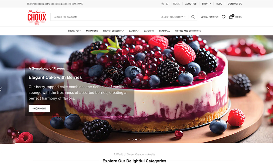
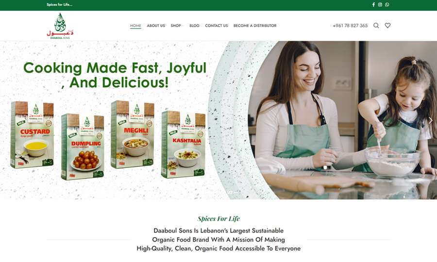
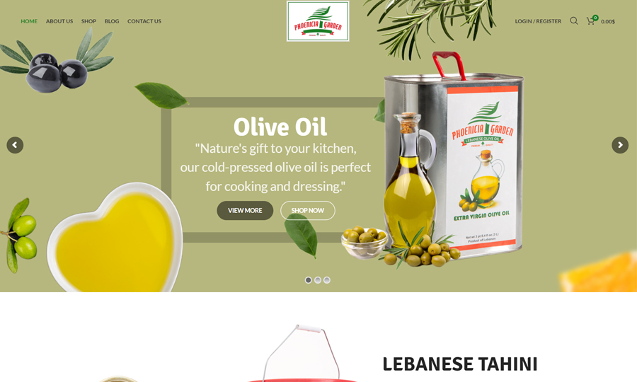
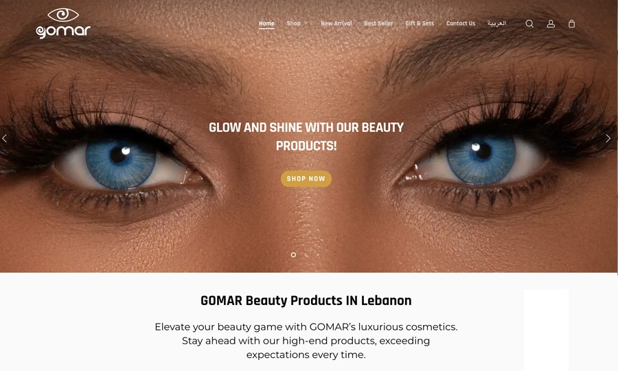
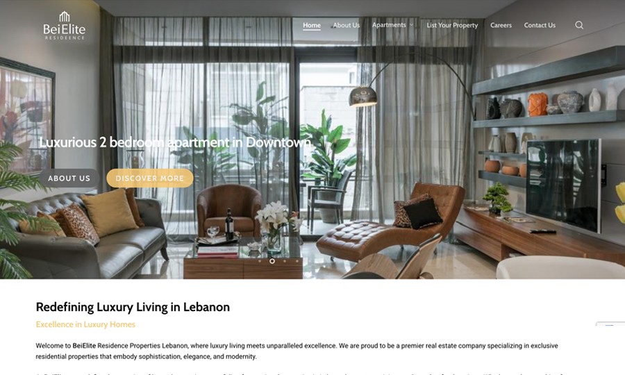
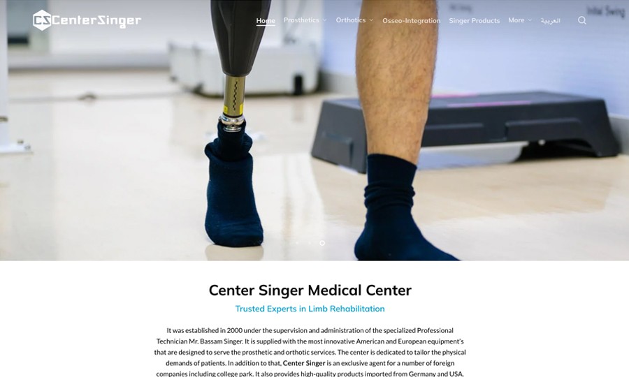
Websites designed and built by our team. Open them on your phone, switch languages where they have them, and see how each layout adapts to the screen.
Open any project to see it larger.
A responsive site is easy to judge: open a project on your phone, turn it sideways and try the menu. Your own site should pass the same test.
Comparing responsive design companies in Lebanon? Ask each one, ours included, whether they will fix your current site or insist on a new one.
Measure
Fix
Test
Responsive website development in Lebanon works on WordPress, other CMSs and custom code alike. We confirm what your site runs on during the mobile test and quote accordingly.
In Lebanon, a business site is often opened from a link: an Instagram bio, a WhatsApp message, a Google Maps listing. All of those happen on a phone, so the mobile version is the one many customers judge you by.
A site that works on a phone in every language fits these habits without asking customers to change theirs.
Five things make the mobile test faster and the quote more precise:
Not sure which pages matter most? We find them in your analytics during step 01.
Creative 4 All s.a.r.l. shapes every mobile-friendly website design in Lebanon around what visitors do on a phone in each sector. Restaurant guests look for the menu and the call button, hotel guests for rooms and dates, patients for opening hours and directions, so the first screen changes from one sector to the next.
Restaurants and cafés
Hotels and guesthouses
Clinics and labs
Shops and showrooms
Schools and universities
Real estate
Car dealers and rentals
Event and wedding venues
Some of the companies and organisations that have worked with our team. Some came to us for mobile fixes, others for a full website or for marketing.
Want your brand on this list? Send your site address to get a mobile fix quote. We come back with questions or a proposal.
The price of mobile work depends on how many templates your site uses, how many languages it has and how the theme was built, so we do not publish a fixed price list. A twenty-page site built on two templates can cost less to fix than a five-page site with a different design on every page.
Most mobile fixes fit one of three sizes:
In your mobile fix quote, we list the templates, languages and screen sizes covered, and say which parts we fix and which we rebuild.

Pages that share a template are fixed together; every different layout adds work.
Arabic needs a mirrored layout and French needs room for longer words; each adds tests.
A clean theme adapts quickly; heavy builders or custom code may need parts rebuilt.
We agree which pages to speed up and measure them; slow hosting can set the limit.
Call our Beirut team:
+961 70 885 385 · +961 1 555 105
Prefer WhatsApp? Send us your site address and a screenshot of what breaks.
Start a WhatsApp chat with our team
or
Some companies answer every mobile problem with a new website. Sometimes that is right, but often the current site can be adapted for less, with its content and search positions intact. A good partner explains which case you are in.
Hesitating is normal, especially when the site still works on a computer. Three quick questions can help:
Do customers call for information that is on your site but hard to find on a phone?
Is Search Console warning you about mobile or Core Web Vitals problems?
Would fixing your two or three main templates cover most of your visitors?
If you answered yes to any of these, request a mobile fix quote.
Questions Lebanese companies ask before adapting their site to phones: fix or rebuild, languages, speed, page addresses and older code.
We look at the theme, the page builder, the plugins and how the templates are made. If the code can carry a responsive layout, we adapt it; if fixing it would cost close to a rebuild, we say so. The recommendation is written into the quote, template by template.
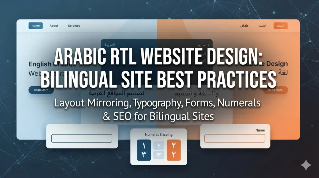
Yes. The Arabic pages get right-to-left styles, mirrored icons and arrows, and Arabic fonts sized for small screens. We test them at phone and tablet sizes like the other languages.
Buttons, menus and headings are made flexible, so longer words wrap cleanly instead of overflowing. We test each template with the real French text, not with English placeholders.
Yes. We test the common iPhone and Android screen sizes, including smaller and older phones, in browser device modes. If your analytics show a phone model many of your visitors use, we add it to the test list.
No. The work changes layouts, not addresses. If a page really has to move, it gets a redirect, so links and search results keep working.
Usually, but we do not promise numbers. We measure speed before and after on the same pages. Slow hosting, heavy third-party scripts or a large catalogue can limit the result; if hosting is the bottleneck, we tell you.
Yes. We turn it into web pages with real text, so it reads on a phone, loads faster and can be found in search. The PDF can stay available as a download.

Yes. Every agreed template is tested at phone, tablet and desktop sizes, because a fix for phones must not break the larger screens.

In most cases, yes. We make them lighter, load them only when visitors reach them, or show a simpler version on phones. If a slider slows the page badly, we suggest an alternative and you decide.
Yes. We work on a staging copy of your site and publish only after you approve it. Your live site keeps running and taking enquiries during the work.
Usually, yes, if we can access the code and the server. We see how it is built during the mobile test and quote after that; some older code is cheaper to rebuild in parts than to patch.
Articles for owners and managers whose site has to work on phones: layout, speed, Arabic and French versions, and what to fix first.