
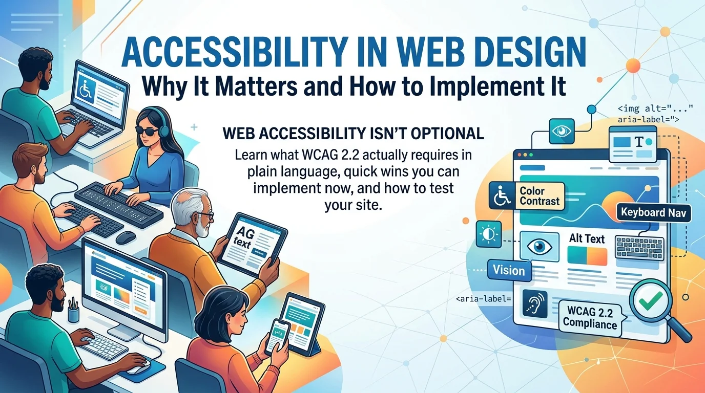
Web accessibility gets treated as a niche compliance concern by many businesses, something relevant only to large corporations or government websites facing legal scrutiny. This framing misses both the ethical and commercial reality: a meaningful share of any audience — people with visual, motor, auditory, or cognitive differences — encounters real barriers on websites not built with accessibility in mind, and a business excluding that audience is leaving genuine customers, students, or constituents unable to use its site at all. Understanding what web accessibility actually requires, in plain language rather than dense technical specification, makes it considerably easier to implement.
Why Accessibility Matters?
Ethical and Business Case
Beyond the straightforward ethical argument — everyone deserves equal access to information and services — accessible website design expands a business’s actual reach. Assistive technology users represent a meaningful share of internet users globally, and a site that excludes them through poor color contrast, missing alt text, or keyboard navigation that simply doesn’t work is turning away real potential customers, students, or clients who would otherwise engage with the business.
Legal Considerations (ADA, WCAG 2.2)
Legal exposure around web accessibility has grown considerably in many jurisdictions, with ADA-related website accessibility lawsuits becoming increasingly common in markets like the United States, and similar legal frameworks emerging elsewhere. WCAG 2.2, the current version of the Web Content Accessibility Guidelines, serves as the technical standard most legal and regulatory frameworks reference, making WCAG compliance a genuinely practical goal regardless of which specific jurisdiction’s requirements apply to a given business, particularly for institutional, educational, or NGO clients who often carry explicit compliance obligations.
Core WCAG Principles in Plain Language
Perceivable
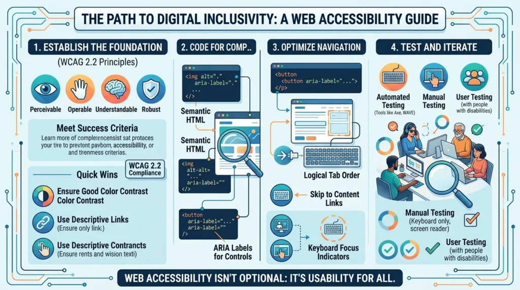
Content needs to be presented in ways users can actually perceive, regardless of how they access it — meaning sufficient color contrast for users with low vision, text alternatives for images so screen readers can describe visual content, and captions for video content for users who are deaf or hard of hearing. This principle addresses the fundamental question of whether information reaches a user at all, before considering anything about how they interact with it.
Operable
Users need to be able to actually operate the interface — navigating using a keyboard alone for users who cannot use a mouse, having enough time to complete actions without arbitrary time limits, and avoiding content that flashes in ways that could trigger seizures. Operability failures often go unnoticed by sighted mouse users entirely, which is precisely why they are so commonly overlooked during typical website testing.
Understandable
Content and interface behavior need to be predictable and clear — using plain, readable language where possible, ensuring navigation behaves consistently across a site, and providing clear error messages and instructions on forms. A site that is technically accessible but confusingly organized or inconsistently structured still creates real barriers, particularly for users with cognitive disabilities.
Robust
Content needs to work reliably across different browsers, devices, and assistive technologies, including older or less common combinations that a business’s own testing might not naturally cover. This principle is largely addressed through following standard, well-supported coding practices rather than custom implementations that may not translate reliably across the full range of tools users actually rely on.
Quick Wins You Can Implement Now
Color Contrast and Text Readability
Checking text and background color combinations against WCAG’s minimum contrast ratios (generally 4.5:1 for normal text, 3:1 for large text) catches one of the most common and easily fixed accessibility issues on business websites. Many existing color contrast checker tools allow pasting in specific color values to get an instant pass or fail result, making this one of the fastest wins available for improving accessible website design without any redesign required.
Alt Text for Images
Adding descriptive alt text to every meaningful image allows screen readers to convey what an image shows to users who cannot see it, and this single practice is both one of the most impactful accessibility improvements and one of the easiest to implement across an existing site. Alt text should describe the image’s actual content and purpose concisely, rather than either leaving it blank or stuffing it with unrelated keywords for SEO purposes.
Keyboard Navigation
Testing whether a site can be fully navigated using only the Tab, Enter, and arrow keys — without ever touching a mouse — reveals keyboard navigation gaps that affect users with motor disabilities and often surprise businesses that have never tested this themselves. Common failures include interactive elements that cannot receive keyboard focus at all, or a focus indicator that is invisible, both of which are usually straightforward fixes once identified.
Testing Your Website’s Accessibility
Free and Automated Tools
Several free automated tools can scan a website and flag common accessibility issues — missing alt text, insufficient color contrast, missing form labels — providing a useful first-pass audit before any manual testing begins. These tools catch a meaningful share of common issues quickly, though they cannot detect every accessibility problem, since some issues (confusing navigation logic, unclear error messages) require actual human judgment to identify.
Manual and User Testing
Beyond automated scanning, manually testing a site using only a keyboard, and ideally testing with an actual screen reader or with a genuine assistive technology user, catches the issues automated tools miss entirely. This manual testing step is where the practical difference between a site that technically passes an automated scan and a site that is genuinely usable for people relying on assistive technology becomes clear.
Inclusive Design as an Ongoing Practice, Not a One-Time Fix
Why Accessibility Needs Ongoing Attention?
Inclusive design is not a checkbox to complete once and forget — new content, new features, and new pages added over time can each introduce fresh accessibility issues even on a site that started out fully compliant. Treating accessibility as an ongoing quality standard, checked as part of a normal content and development workflow rather than a one-time audit project, keeps a site genuinely accessible as it evolves rather than slowly drifting back into non-compliance.
Training Content Teams on Basic Inclusive Design Habits
Much of what inclusive design requires on an ongoing basis — writing meaningful alt text, using proper heading structure, avoiding color as the only way to convey information — can become a normal habit for whoever manages a website’s content, rather than requiring a developer’s involvement for every update. Investing a small amount of time training content teams on these basics produces considerably more consistent accessibility outcomes than relying entirely on periodic technical audits to catch problems after the fact.
Accessibility and SEO: A Genuine Overlap
Shared Technical Foundations
Many accessibility best practices — descriptive alt text, clear heading hierarchy, logical page structure — directly overlap with technical SEO fundamentals, since search engines and screen readers both rely on well-structured, clearly labeled content to understand a page correctly. A business investing in accessibility often sees meaningful SEO benefits as a natural byproduct, rather than needing to treat these as two entirely separate initiatives competing for the same development resources.
Avoiding Keyword-Stuffed Alt Text
One place these two goals can conflict is alt text written primarily for search engine keyword targeting rather than genuine image description, which actively harms the screen reader experience even as it attempts to serve an SEO purpose. Writing alt text that accurately and concisely describes an image’s actual content serves both accessibility and SEO well simultaneously, while keyword-stuffed alt text serves neither purpose effectively.
Frequently Asked Questions
No, accessibility genuinely matters for any business website, both because it expands the audience able to use the site and because legal exposure around accessibility increasingly extends beyond large organizations. Institutional, educational, and NGO clients in particular often carry explicit compliance obligations that make this a practical necessity rather than an optional consideration.
WCAG 2.2 is the current version of the Web Content Accessibility Guidelines, organized into three conformance levels (A, AA, AAA), with Level AA generally serving as the practical standard most legal frameworks and organizations target. Full AAA compliance is rarely required or even fully achievable for most business websites, making Level AA a reasonable and genuinely achievable goal.
This varies considerably based on the site’s current state and how many issues exist, but many of the highest-impact fixes (color contrast, alt text, basic keyboard navigation) are relatively low-cost to implement compared to a full redesign. Addressing these quick wins first often resolves a meaningful share of accessibility issues before considering more comprehensive remediation.
No, automated tools catch a genuinely useful share of common issues but cannot identify every accessibility problem, particularly those involving judgment about clarity, navigation logic, or genuine usability with assistive technology. Combining automated scanning with manual keyboard testing and, ideally, testing with real assistive technology users produces a far more accurate picture.
Generally no — accessible design principles like sufficient color contrast, clear navigation, and readable text tend to improve the experience for all users, not just those relying on assistive technology. Well-executed accessible design and strong visual design are complementary goals rather than competing ones in the vast majority of cases.
Ready to Make Your Website Genuinely Accessible?
Web accessibility is both the right thing to do and a practical way to expand who can actually use your website. Creative 4 All builds and audits websites for accessibility across Lebanon and the GCC, helping institutional, educational, and business clients meet WCAG standards without compromising design quality. Request a Website Quote to discuss what accessibility improvements would matter most for your site.