
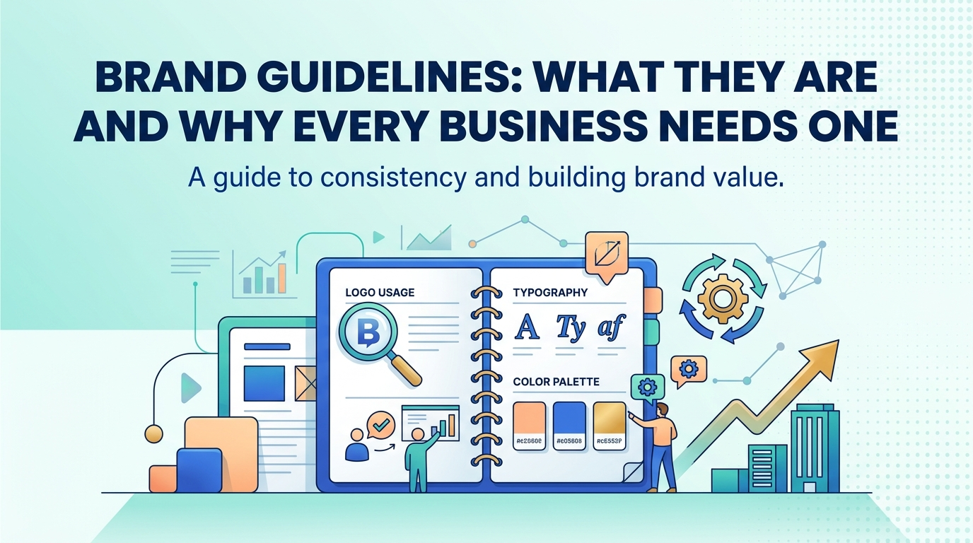
Most business owners have a rough mental picture of their brand — the logo, roughly which colors get used, maybe a general sense of tone. What they rarely have is that picture written down anywhere a designer, a new employee, or an outside agency could actually reference it. This gap is precisely what brand guidelines exist to close. A brand guidelines document turns an owner’s mental picture of the brand into an explicit, shareable reference that anyone touching the brand can follow consistently, regardless of whether that person has been with the company for ten years or was hired yesterday.
For businesses that have never worked with one, it can be hard to understand what a branding engagement actually produces beyond a logo file. This kind of document is usually the most tangible, immediately useful deliverable of that process — a working reference the business will consult constantly for years, not a one-time creative artifact that gets admired once and then forgotten.
What a Brand Guidelines Document Actually Contains?
Logo Usage Rules and Variations
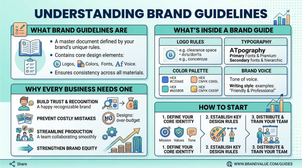
The logo section of any brand style guide covers far more than the logo file itself. It specifies minimum sizing to keep the logo legible, clear space requirements around the logo so it never gets crowded by other elements, approved color variations (full color, single color, reversed for dark backgrounds), and explicit examples of misuse — stretching, recoloring, or placing the logo on a background that reduces contrast. Without this documentation, it is remarkably common for a logo to end up stretched, squeezed, or recolored inconsistently across different materials simply because nobody had a clear reference for how it should actually be used.
Color Palette and Typography Specifications
A proper brand book specifies exact color values — hex codes for digital use, CMYK and Pantone values for print — rather than a vague description like “a shade of blue.” This precision matters enormously in practice, since two different designers approximating “brand blue” from memory will almost never land on the exact same shade, and small color drift across materials is one of the most common ways a brand starts to look inconsistent without anyone quite noticing why. Typography specifications work the same way: naming the exact primary and secondary typefaces, specifying which weights and sizes to use for headlines versus body text, and providing fallback fonts for situations where the primary typeface is not available.
Tone of Voice and Messaging Documentation
Visual identity guidelines are only half of a complete brand guidelines document. The other half — tone of voice documentation — specifies how the brand actually sounds in writing: formal or conversational, the specific vocabulary the brand favors or avoids, and example phrases showing the tone in action across different contexts (a product description, a customer service response, a social media post). This section is often the most neglected part of the document, yet inconsistent tone across channels is just as noticeable to a customer as an inconsistent logo, even if it is harder to name specifically.
Why Consistency Compounds Brand Value Over Time?
How Repeated Exposure Builds Recognition
Brand recognition is built through repetition of consistent visual and verbal cues encountered across many touchpoints over time. Every time a customer sees the same colors, the same logo treatment, and the same tone of voice, that repetition reinforces a mental association that grows stronger with each consistent exposure. When those elements shift unpredictably from one touchpoint to the next — a slightly different blue on the website than on the packaging, a formal tone in emails but a casual tone on social media — that repetition effect breaks down, and the brand has to work much harder to build the same level of recognition.
The Cost of Inconsistency Across Touchpoints
Inconsistency carries a real, if often invisible, cost. A prospective customer encountering a brand that looks and sounds different across its website, social media, and physical materials has to work harder to recognize the connection between those touchpoints, and any moment of confusion is an opportunity for that prospect’s attention or trust to drift elsewhere. This cost compounds as a business grows and adds more touchpoints — more employees creating content, more vendors producing materials, more channels to maintain — which is exactly why the businesses that benefit most from a documented visual identity system are often the ones scaling quickly enough that a single founder can no longer personally review every piece of output.
How Guidelines Prevent Costly Design Mistakes?
Avoiding Off-Brand Vendor and Freelancer Work
Any business that occasionally works with outside designers, printers, or freelance content creators has likely experienced the frustration of receiving work that is technically fine but simply does not look or sound like the brand. Handing a vendor a complete brand guidelines document upfront dramatically reduces this problem, since it replaces vague verbal instructions (“make it look professional, use our colors”) with an explicit, unambiguous reference the vendor can follow precisely. This alone often pays for the cost of developing the document many times over, since revision cycles caused by off-brand first drafts are expensive in both time and money.
Onboarding New Team Members and Agencies Faster
A new marketing hire, a newly engaged agency, or a freelance designer working with the brand for the first time faces a steep learning curve without a documented reference, typically absorbing the brand’s visual and verbal conventions slowly through trial, error, and feedback from more senior team members. A complete guidelines document collapses much of that learning curve into a single reference that can be reviewed before any work begins, meaning new collaborators can produce on-brand work from their very first project rather than needing several rounds of correction first.
What to Look for in a Brand Guidelines Document?
Signs a Guidelines Document Is Actually Complete
A genuinely useful reference document goes well beyond a logo and a color palette. It should include enough detail that someone with no prior exposure to the brand — a new designer, an outside agency, a new employee — could produce reasonably on-brand work using only the document itself. If it leaves major gaps that still require a phone call or a guess (“what font do we use for headlines again?”), it is incomplete regardless of how polished the pages themselves look.
When to Update Brand Guidelines?
Brand guidelines are not a static, one-time deliverable. They should be revisited whenever the business adds a significant new product line, expands into a new market with different visual or cultural expectations, or undergoes any kind of brand refresh, however minor. A guidelines document that has not been touched in several years while the business has meaningfully evolved often no longer reflects how the brand actually presents itself in practice, which defeats the purpose of having the document at all.
What a Complete Document Looks Like in Practice?
Brand Values and Positioning Statements
Beyond the purely visual and verbal rules, a thorough reference document often includes a short section on brand values and positioning — a concise statement of what the business stands for and how it wants to be perceived relative to competitors. This section rarely gets referenced daily the way logo specifications do, but it provides useful context that helps anyone applying the more tactical rules understand the reasoning behind them, which in turn makes it easier to make sensible judgment calls in situations the document does not explicitly cover. A short paragraph explaining the intended audience and the emotional impression the brand aims to leave can be enough to guide dozens of smaller decisions that no rulebook could anticipate individually.
Application Examples Across Real Materials
The most useful documents do not stop at abstract rules; they show those rules applied to real, representative materials — a business card, a social media post template, an email signature, a signage mockup. Seeing the color palette and typography rules applied to an actual example removes ambiguity that an abstract specification alone cannot fully resolve, and it gives anyone using the document a concrete template to work from rather than having to interpret written rules from scratch every time. Institutions that skip this step often find that even a well-written rulebook still produces inconsistent results, simply because translating written specifications into a finished layout requires design judgment that examples make far easier to replicate correctly.
Common Mistakes Businesses Make With Their Brand Documentation
Treating It as a One-Time Design Deliverable
Some businesses commission a beautifully designed reference document, store it in a folder, and never look at it again. The value of this kind of documentation comes entirely from active use — referencing it before every new marketing piece, sharing it with every new vendor, and actually enforcing the rules it contains. A polished document that nobody consults provides essentially no protection against the inconsistency it was created to prevent.
Making It Too Restrictive to Actually Use
The opposite failure mode is a document so rigid and exhaustive that people find it easier to ignore than to follow. Overly prescriptive rules covering every conceivable scenario in exacting detail can make the reference feel like an obstacle rather than a helpful tool. The most effective versions strike a balance — clear enough to prevent the mistakes that actually matter, flexible enough that people do not feel compelled to work around them.
Frequently Asked Questions
Length varies significantly by business complexity, but a genuinely useful document for a small to mid-sized business typically runs somewhere between 15 and 40 pages, covering logo usage, color and typography, tone of voice, and enough real-world examples to make the rules concrete rather than abstract.
Yes, arguably more than large businesses in some respects, since small businesses often rely heavily on freelancers and outside vendors who have no ongoing exposure to the brand. A concise, clear guidelines document prevents the inconsistency that can quietly undermine a small brand’s credibility as it works with multiple external collaborators.
The terms are often used interchangeably, though “style guide” sometimes refers specifically to the visual identity rules (logo, color, typography), while “brand guidelines” or “brand book” more often implies a fuller document that also covers tone of voice, messaging, and brand values. In practice, most businesses benefit from a single combined document covering both.
Ideally the people who will actually use the document day to day — marketing staff, anyone managing outside vendors, and whoever handles customer-facing communication — should have input, since a guidelines document created in isolation by a designer without input from the people applying it daily often misses practical details that only become apparent through real use.
An annual review is a reasonable minimum cadence for most businesses, with more immediate updates triggered by any significant brand change — a new product line, market expansion, or visual refresh. Guidelines that go untouched for several years while the business evolves quietly lose their usefulness.
Ready to Build Guidelines That Actually Get Used?
Brand guidelines only create value when they are complete enough to actually prevent inconsistency and clear enough that people actually use them. Creative 4 All builds practical, thorough brand documentation for businesses across Lebanon and the GCC — covering logo usage, color and typography, and tone of voice in a single reference your team and vendors can rely on. Book a Branding Discovery Call to talk through what a brand guidelines document for your business should include.