
A beautiful website and a website that converts are not automatically the same thing, and mistaking one for the other is one of the most expensive assumptions a business can make about its own site. Plenty of visually striking websites generate disappointing lead volume, while some genuinely plain-looking sites convert at rates their prettier competitors would envy. UX design for conversions isn’t about making a site look impressive to the business owner reviewing it internally; it’s about removing every point of friction and confusion between a visitor arriving with a need and that visitor taking the action the business actually wants.
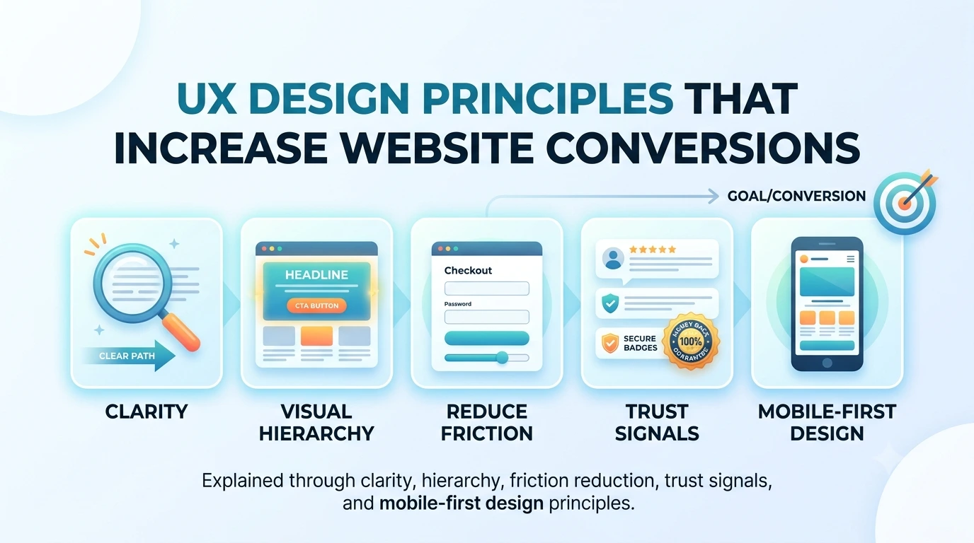
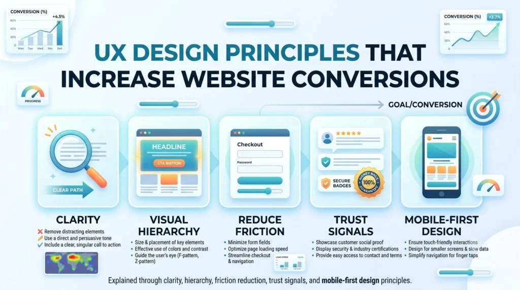
This guide walks through why aesthetics alone don’t move the needle, the core principles of UX design for conversions — clarity, visual hierarchy, friction reduction, and trust signals — how mobile-first thinking changes UX priorities, and concrete before-and-after patterns that show these principles in action.
Why Aesthetics Alone Don’t Convert?
A visually polished design can still fail to convert if a visitor can’t quickly understand what the business offers, why they should trust it, or what to do next. Aesthetics and usability are related but distinct — a site can look modern and professional while still burying its primary call-to-action below three scrolls of decorative content, or use a beautiful custom font that’s genuinely difficult to read at the size it’s been set. Conversion-focused UX treats visual design as one tool among several, evaluated by whether it helps or hinders the visitor’s path to action, not by whether it wins approval in a design review.
This is precisely the gap between a design portfolio piece and a working business asset. UX design for conversions asks a different question at every decision point than pure visual design does: not “does this look good,” but “does this make it easier or harder for a real visitor, under real time pressure, to understand what to do next.” A portfolio-worthy design and a conversion-worthy one can overlap significantly, but only when the visual choices are made in service of the visitor’s journey rather than in isolation from it.
Core UX Principles for Conversion
Clarity
Clarity means a visitor can understand what a business does, who it’s for, and what action to take within seconds of landing on a page, without needing to piece it together from scattered information. This starts with the headline and hero section, which should communicate the core value proposition immediately rather than opening with a clever tagline that requires context the visitor doesn’t have yet. Clarity extends through every section of a page — clear labels on navigation and buttons, straightforward language over internal jargon, and a single obvious next step rather than several competing calls-to-action fighting for the same attention.
Visual Hierarchy
Visual hierarchy is how a page guides the eye toward what matters most, using size, contrast, spacing, and placement to signal importance before a visitor reads a single word. A page with strong hierarchy makes the primary action — book a call, request a quote, add to cart — visually unmistakable, while secondary information recedes appropriately rather than competing for the same visual weight. Weak hierarchy is one of the most common reasons a well-written page still underperforms: the words might say the right things, but if the visual design doesn’t direct attention toward the conversion point, most visitors simply won’t find their way there.
Friction Reduction
Every additional step, unclear field, or unnecessary decision a visitor has to make between arriving and converting reduces the percentage who actually complete that journey. Friction reduction means auditing every form, every click path, and every moment of hesitation a real user might encounter — does a contact form ask for information that isn’t actually necessary at this stage, does a multi-step checkout process feel longer than it needs to, does a visitor have to hunt for pricing information that should be immediately visible. Reducing friction rarely means adding something new; it usually means removing steps, fields, and decisions that don’t serve the visitor’s actual goal.
Trust Signals
A visitor who understands what a business offers and knows exactly what to do next will still hesitate if they don’t trust the business enough to act. Trust signals — client testimonials placed near the point of decision, recognizable logos of past clients or certifications, transparent pricing or process information, genuine reviews rather than vague claims of quality — address the hesitation that clarity and hierarchy alone can’t resolve. This is particularly important for higher-consideration purchases or service inquiries, where a visitor is being asked to trust a business with something significant, whether that’s a project budget or personal information.
Mobile-First UX Considerations
With mobile traffic making up the majority of visits for most businesses, designing for mobile first — rather than designing for desktop and shrinking it down — has become essential rather than optional for conversion-focused UX. Mobile screens have far less room to establish hierarchy and clarity, which means the priorities above become even less forgiving: a confusing desktop layout might still convert reasonably through sheer screen real estate, but the same confusion on a small screen loses visitors far faster.
Practical mobile-first considerations include tap targets sized appropriately for fingers rather than cursors, forms simplified further than their desktop equivalent since typing on mobile is inherently more effortful, and critical information like pricing, contact details, or a primary call-to-action positioned high enough that a visitor doesn’t need to scroll extensively to find it. A site that works well on desktop but frustrates mobile visitors is, in practical terms, frustrating the majority of its actual traffic.
Before-and-After Patterns
Seeing these principles in contrast makes them concrete. A “before” hero section might lead with a stylized, abstract headline and a small, low-contrast button beneath several lines of company history; an “after” version leads with a direct statement of value, a single high-contrast call-to-action button, and defers the company history to a later section a genuinely interested visitor can scroll to. A “before” contact form might ask for eight fields including several that aren’t actually needed to start a conversation; an “after” version asks for only name, contact method, and a brief note, moving anything else to a follow-up conversation once trust and interest are already established.
A “before” pricing page might hide pricing behind a “contact us” wall with no indication of scale; an “after” version, where pricing transparency fits the business model, gives at least a starting range or package structure so a visitor can self-qualify before investing time in an inquiry. In each case, the “after” pattern isn’t necessarily less detailed or less professional — it’s simply organized around what actually helps a visitor move forward, rather than what felt complete from an internal, company-first perspective.
Measuring Whether UX Changes Actually Work
Applying these principles isn’t a one-time design pass — UX design for conversions only earns its name when changes are actually measured against real conversion data rather than assumed to be improvements because they look cleaner. Basic conversion rate optimization practices apply directly here: tracking the conversion rate before and after a change, testing one meaningful change at a time where possible rather than redesigning everything simultaneously, and paying attention to where in the user journey visitors actually drop off rather than guessing based on intuition alone.
Usability testing plays a complementary role to this quantitative tracking. Watching even a handful of real users attempt a specific task on the site — request a quote, find pricing, complete a contact form — surfaces friction points that conversion data alone might not fully explain, since the numbers show that visitors are dropping off at a particular step but not necessarily why. Combining both approaches — measuring what’s happening and observing why it’s happening — turns UX work from a matter of taste into a measurable, defensible part of a business’s growth strategy.
Frequently Asked Questions
No. Clarity, hierarchy, friction reduction, and trust signals are structural principles that work within nearly any visual style or brand personality — a playful, colorful brand and a formal, corporate one can both apply these principles while looking completely different from each other.
Usability testing with a handful of real users — even five people unfamiliar with the site, asked to complete a specific task like requesting a quote — often reveals friction points a business owner can’t see themselves, since internal familiarity with the site hides problems a first-time visitor experiences immediately.
No. B2B buyers research on mobile devices just as often as consumers do, even if the final decision or purchase happens later on desktop. A frustrating mobile experience during that early research phase can eliminate a business from consideration before a desktop visit ever happens.
The specific improvement varies by site and starting point, but businesses addressing genuine friction points — confusing navigation, buried calls-to-action, excessive form fields — commonly see meaningful, measurable lifts in conversion rate, since these issues directly block visitors who already had genuine interest.
Incremental improvement is usually the more effective approach. Identifying the highest-friction points first — the pages and steps where the most visitors are dropping off — and addressing those specifically tends to produce faster, more measurable results than a full redesign undertaken all at once.
Ready to Turn Your Website Into a Conversion Asset?
A visually appealing website that doesn’t convert is a missed opportunity every day it stays online. Request a website quote from Creative 4 All and get a UX design for conversions evaluation of what’s actually helping or hurting your site’s performance.